Remesh
Intro
I've been working closely with <remesh for a while to redesign their web interface and to design a new iOS UI.
Scope
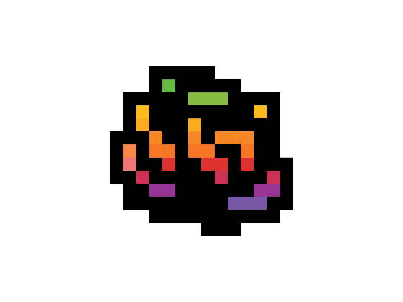
T-shirt Design Explorations
I was asked to design some t-shirts after I designed the app, and I worked on some explorations. Some are terrible, some are great, but none were used because we made the decision to just put the <remesh logo on the t-shirt. Anyhow, here are the designs that arose from my design experimentation.
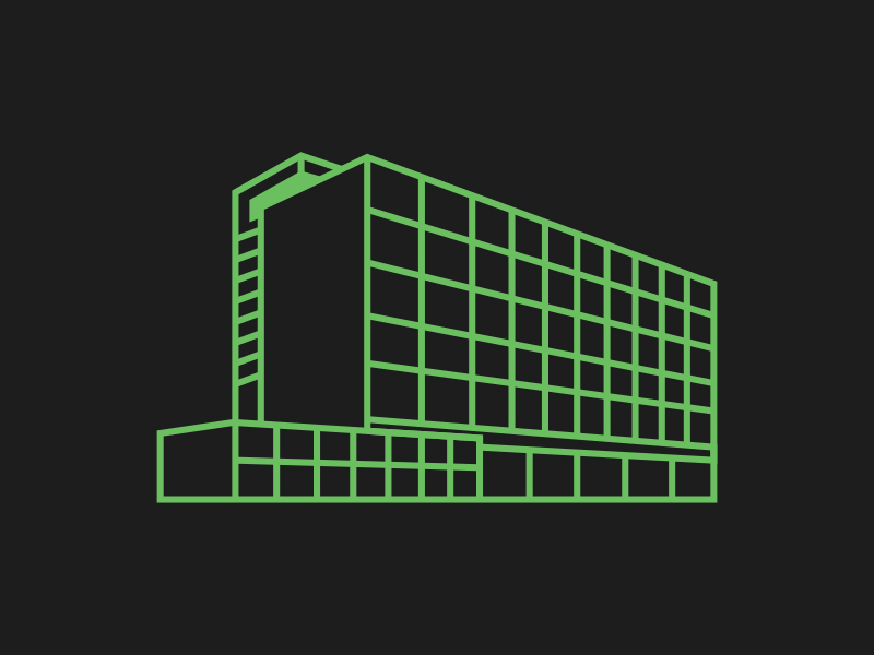
Web App Interface
We started out with the web interface. I focused on whitespace and typography to give the content and the essential features the focus.
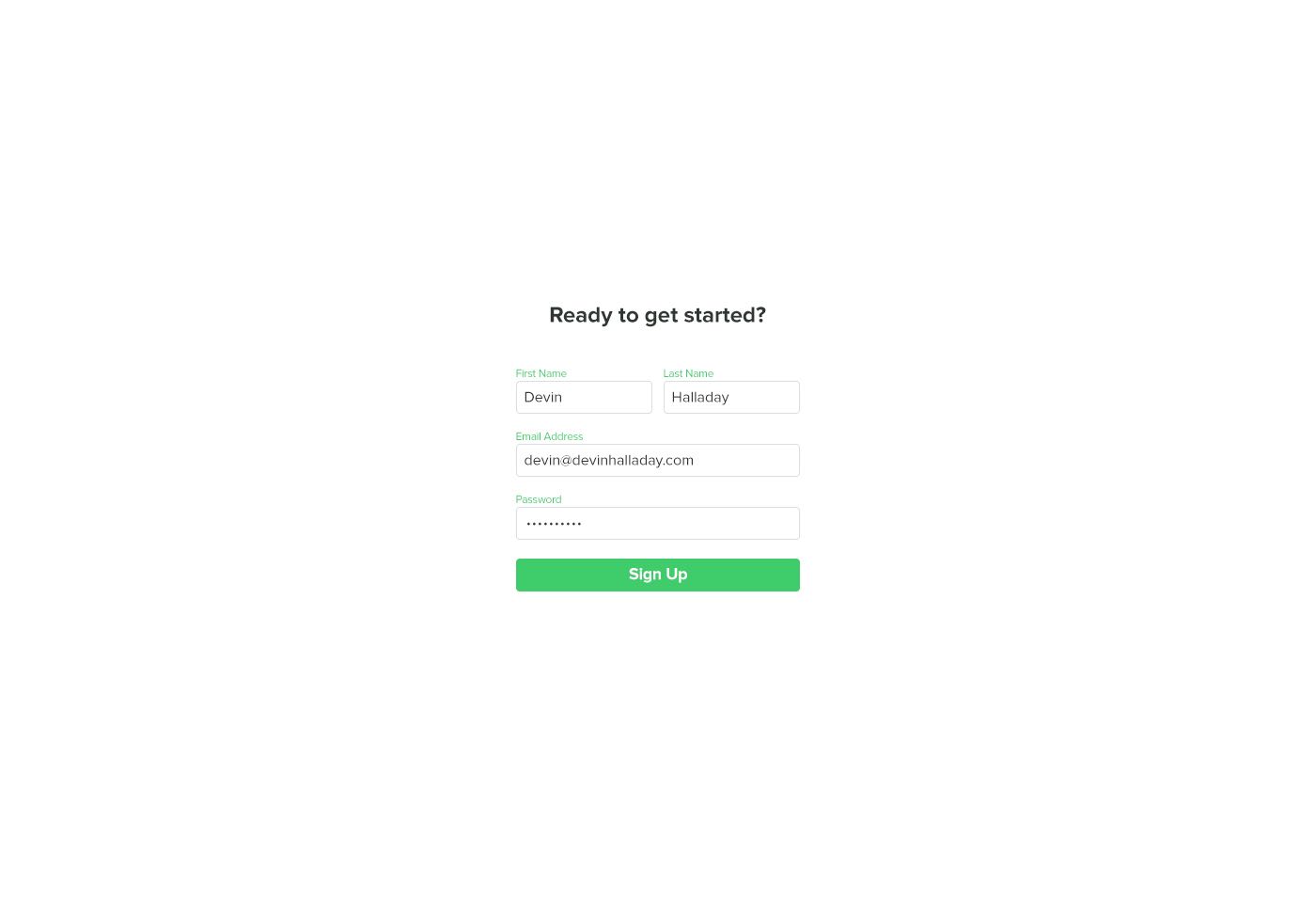
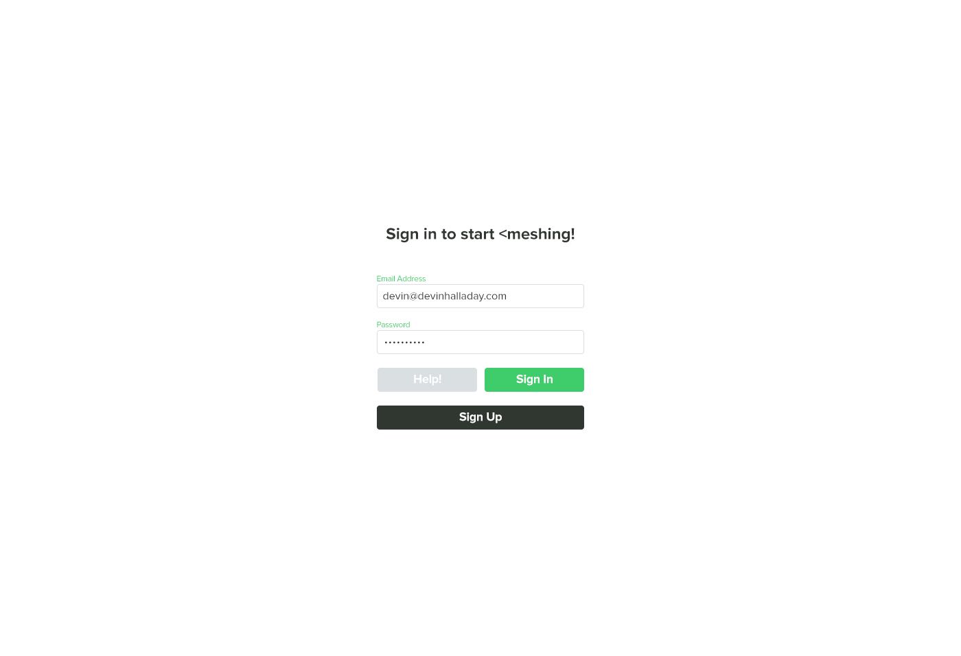
Sign Up and Sign In Screens
Empty State
Used when no conversation is selected.
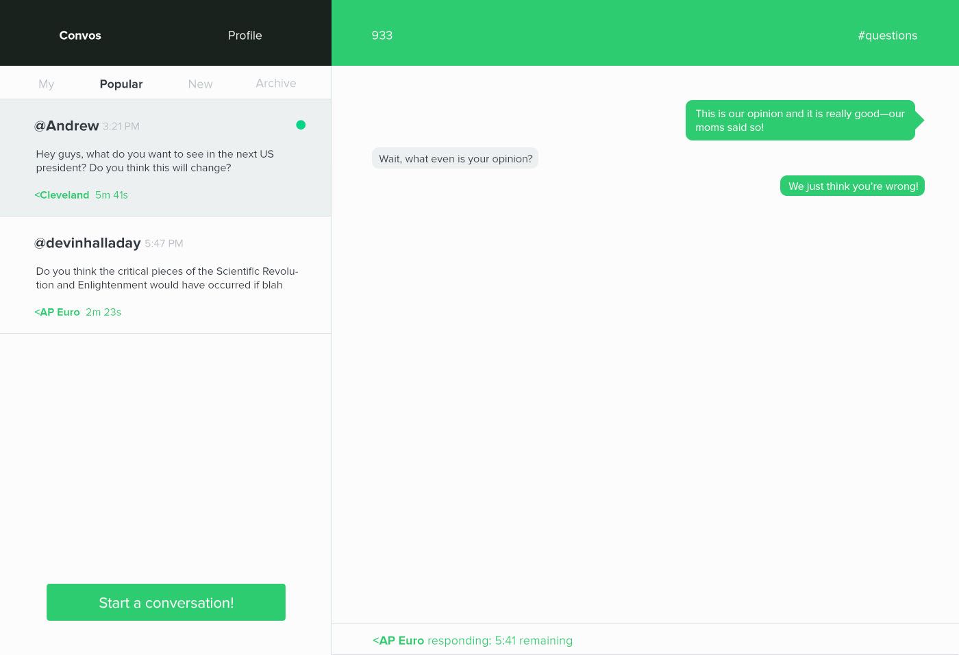
Waiting Screen
Shown when the other @user or <mesh is currently speaking.
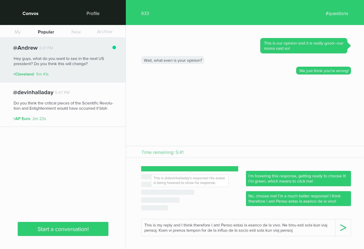
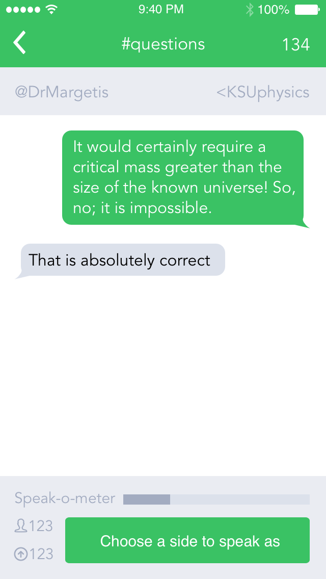
Voting Screen
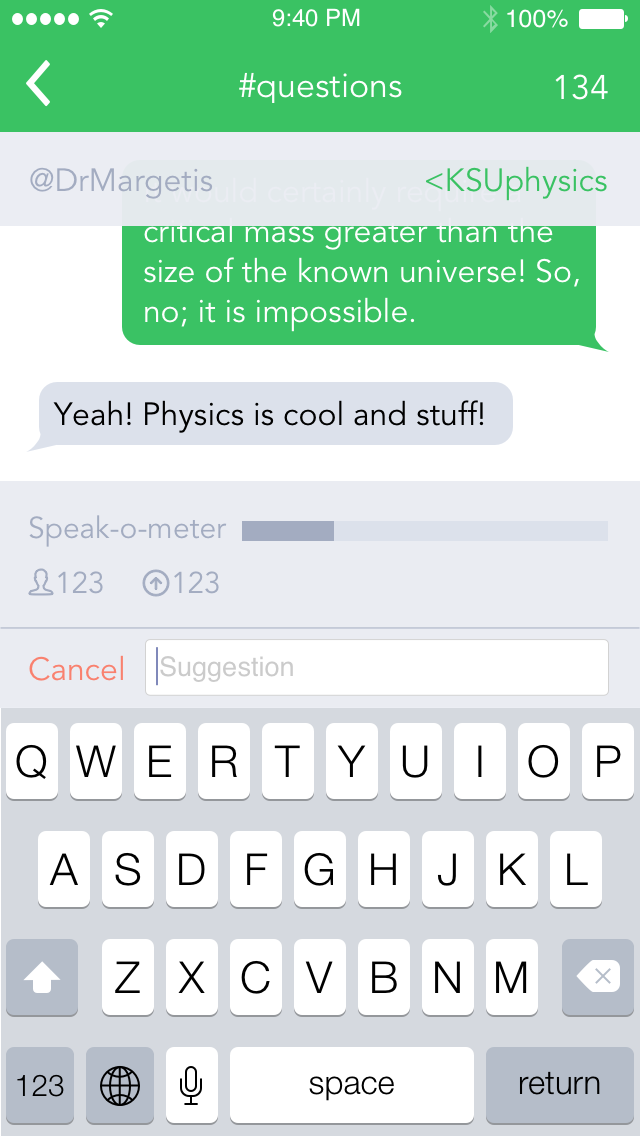
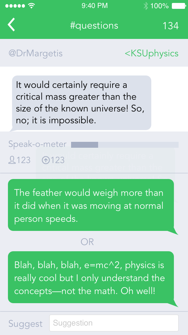
It's shown when a user or that user's <mesh is currently speaking. It allows a user to enter a response, vote on other responses, and view the responses that currently have the most votes. At the end of a countdown, the response with the most votes goes through to the other user or <mesh in the conversation.
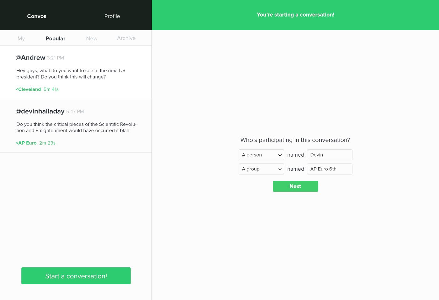
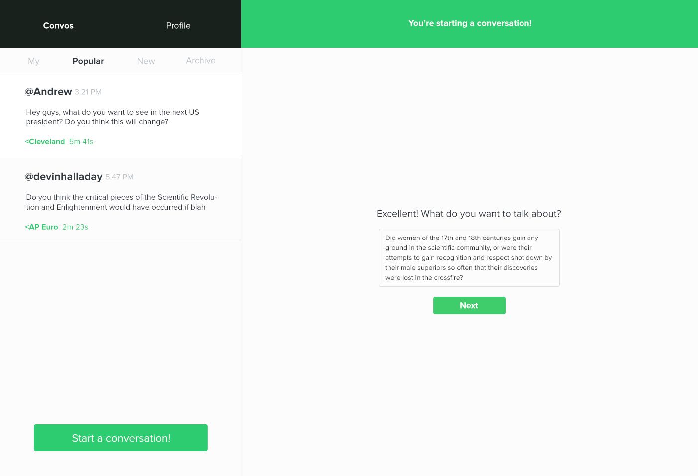
Starting a Conversation, Stage One
When a user wants to start a conversation, they enter this screen. It allows the user to choose a combination of @users or <meshes who will partake in the conversation.
Starting a Conversation, Stage Two
During this stage, the user writes the basis of the conversation.
iOS Interface
After working on the web interface, I had a good understanding of exactly what <remesh does. With this in mind, Andrew, the founder of <remesh, contacted me again to begin work on the iOS interface.
This was only the third iOS project I've ever worked on, and it was the first full iOS app that I designed. The challenge and learning curve were both steep for me because I come from more of a traditional design background, but I surmounted the challenge. I've done quite a bit of web design, but now that I've had a chance to work with iOS I like designing for the iPhone so much more; I really appreciate and enjoy working within the contraints of absolute screen sizes.
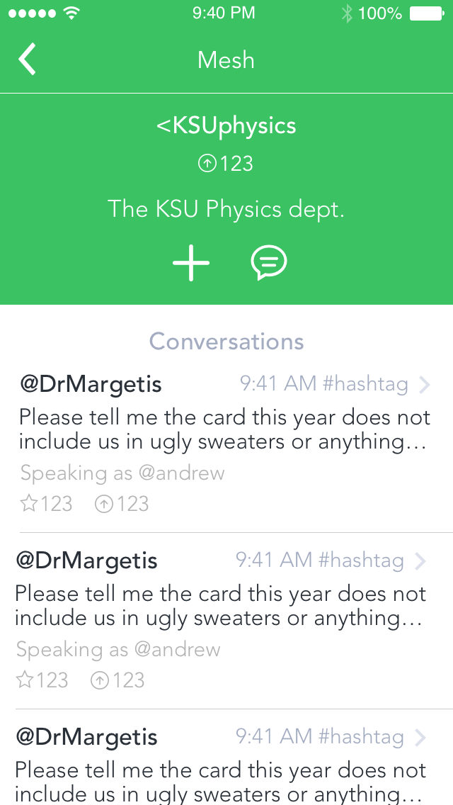
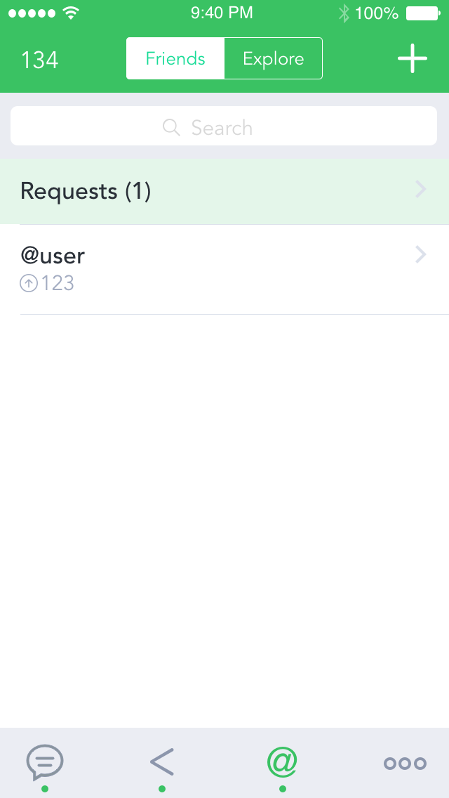
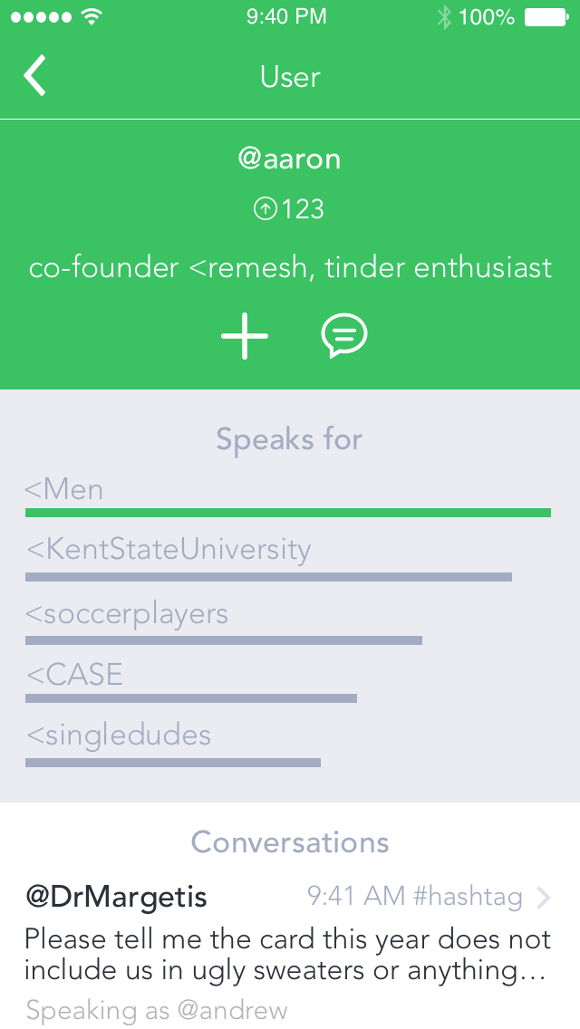
@user and <mesh views
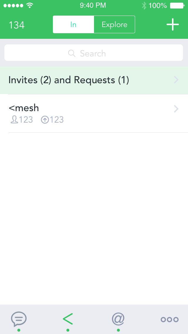
Conversation Views
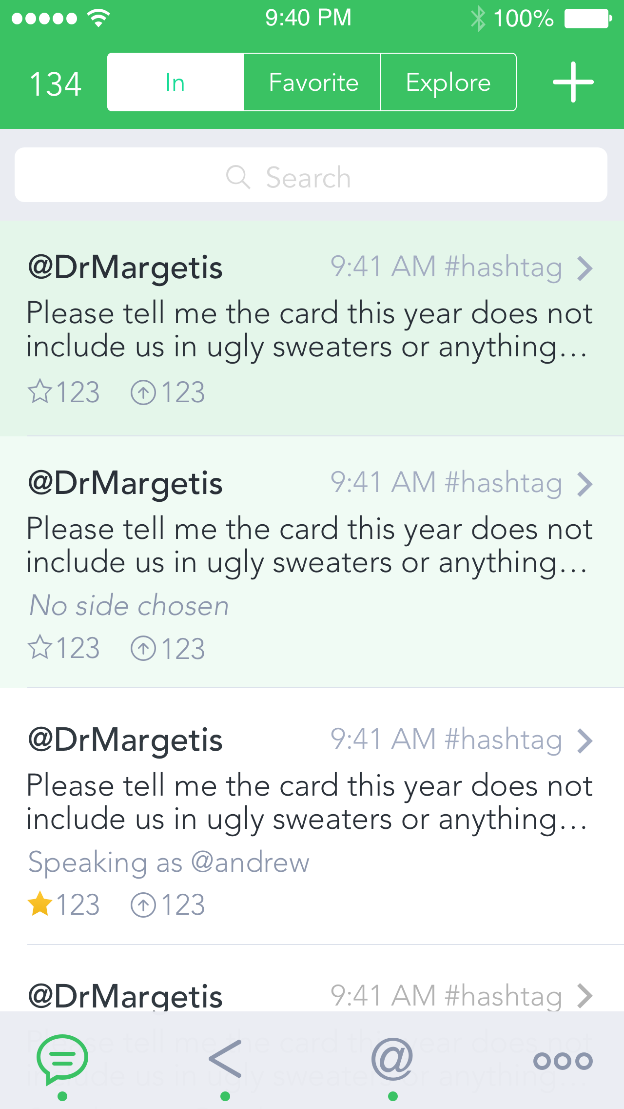
This screen shows you conversations you have already joined and notifications for invitations to join conversations. If you have been invited to a conversation but haven't viewed it yet, the conversation is highlighted in a brighter green. If you've been invited to a conversation and viewed it, but haven't joined yet, it is highlighted in a slightly lighter shade of green.
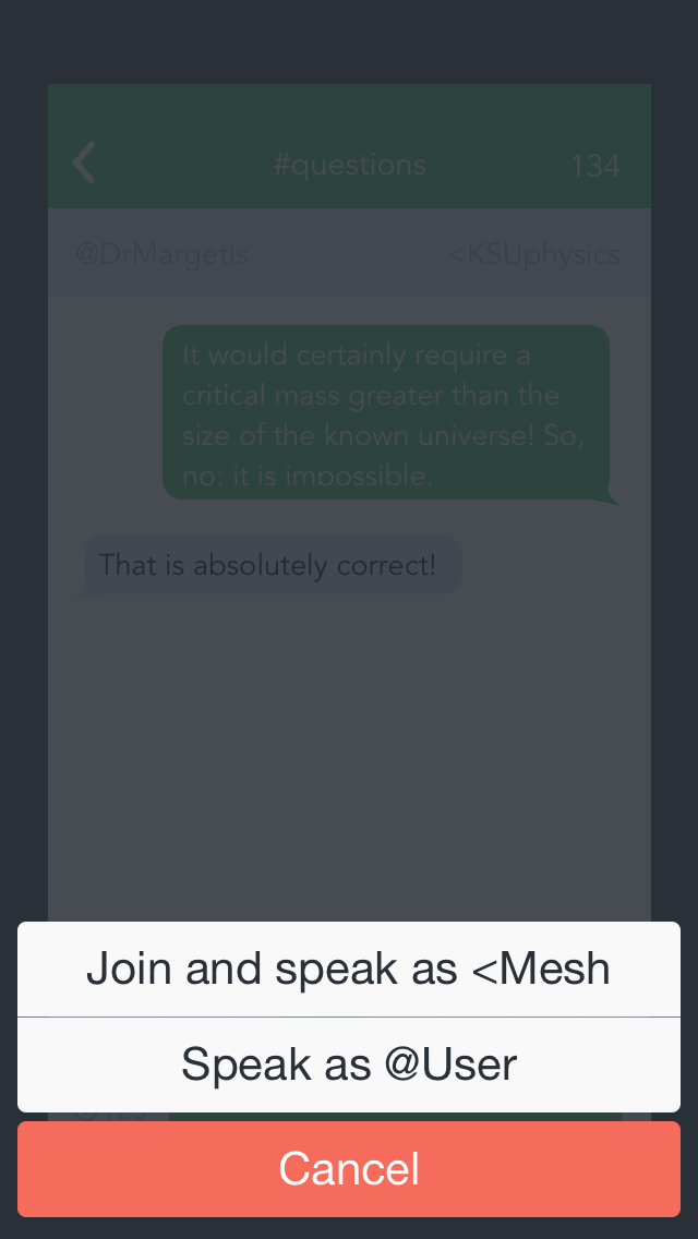
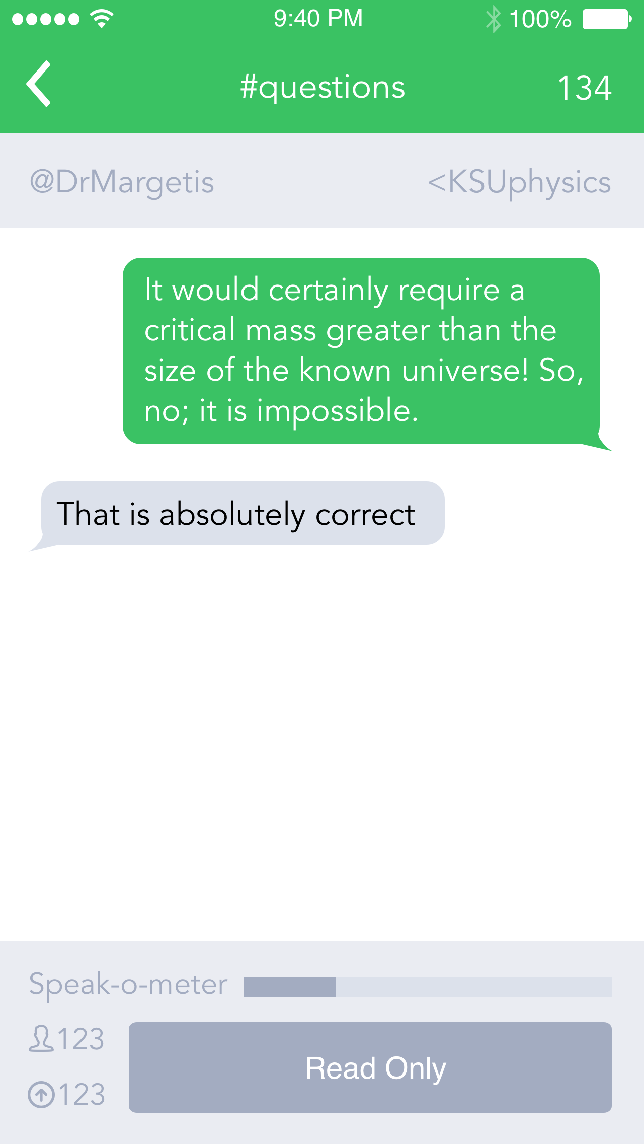
If you're viewing a conversation but haven't been invited to it, you will see the read-only state. Once you're in a conversation, though, you can access the voting and suggestion interface.
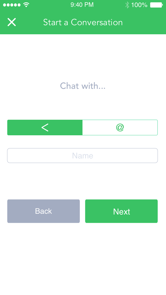
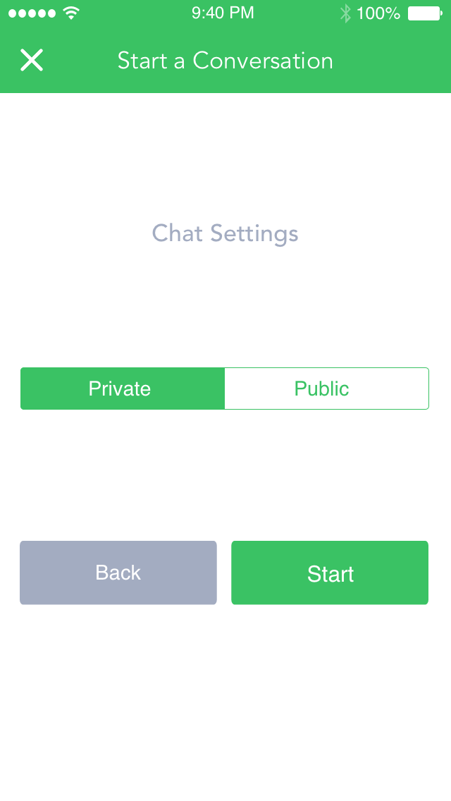
Starting a Conversation
When you want to start a new conversation, you go through three stages. You choose a user or <mesh to speak as, then a user or <mesh to speak with, and then choose whether you want the conversation to be public or private. That's it!

Conclusion
This project has been so much fun to work on. While it's still a work in progress and we're constantly changing things, I like the direction this is going in. I've learned a lot about UI design and how to follow UI guidelines like Apple's HID Guidelines. I can't wait until this project comes to fruition!