Blackbird Magazine
Intro
Blackbird is a print magazine that explores the lives and work of people who are extremely passionate about what they do.
Scope
Background
Blackbird is an indie print magazine that I'm publishing (hopefully this summer). It was born out of my passion for printed media. I began my design career doing digital design work exclusively, and that's what I do for most of my clients, but I feel a need to work on something tangible—an analog product.
This project's inception was about three years ago, but it was originally under a different name and idea: The Guild, a print and digital publication dedicated to graphic design. The Guild died off because of a lack of time on my end, but last year it was reincarnated as Blackbird. Blackbird is going to focus on the story behind people who are extremely passionate about what they do.
Type Pairing
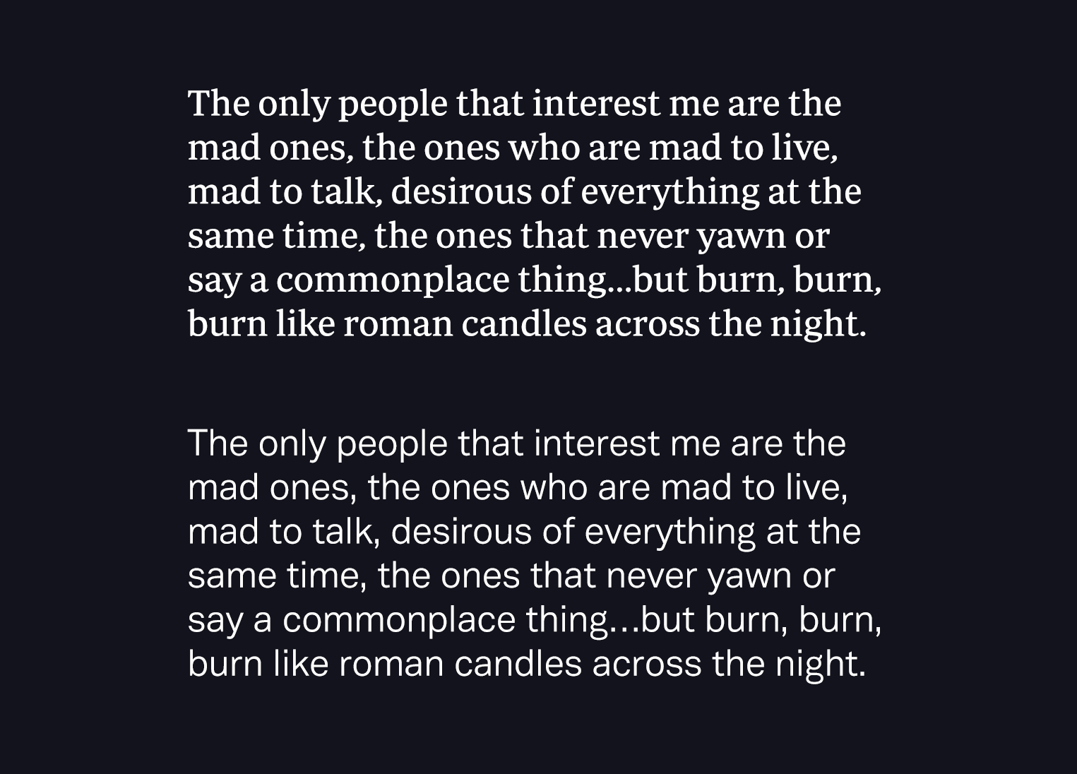
The magazine is set in Periodico Text (the serif font) by Emtype and Vaud (the sans-serif font) by Wordshape. The two really complement each other with a similar x-height, contrast level, and letter width.
Visual Identity
The identity I designed for Blackbird is meant to be strong yet personal, lending homage to the nature of print.
The wordmark uses a customized version of Periodico Display. The other mark, which I call the Birdmark (get it?) is used very sparingly.

A secondary mark used primarily to mark the end of an article.
Page Spreads
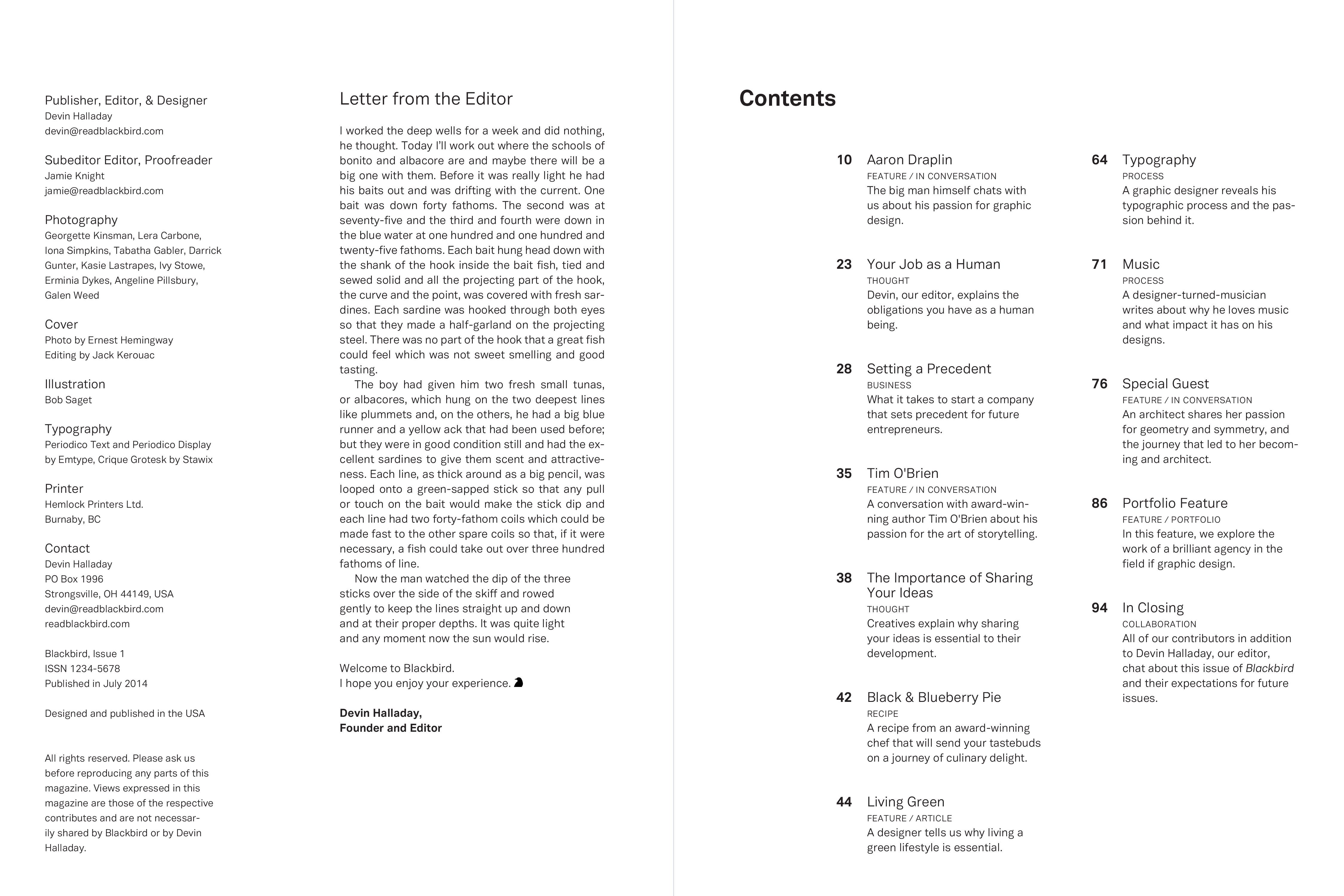
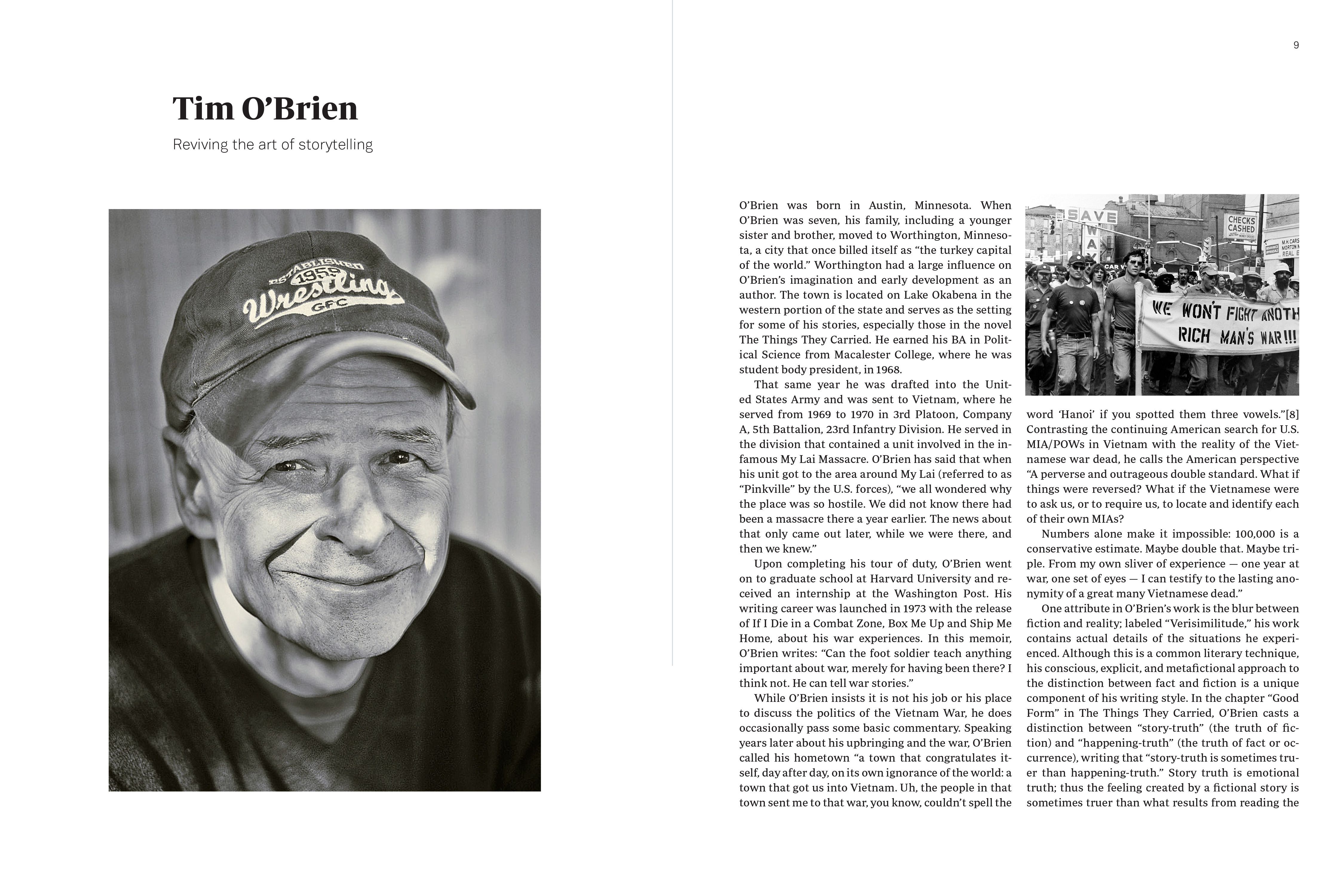
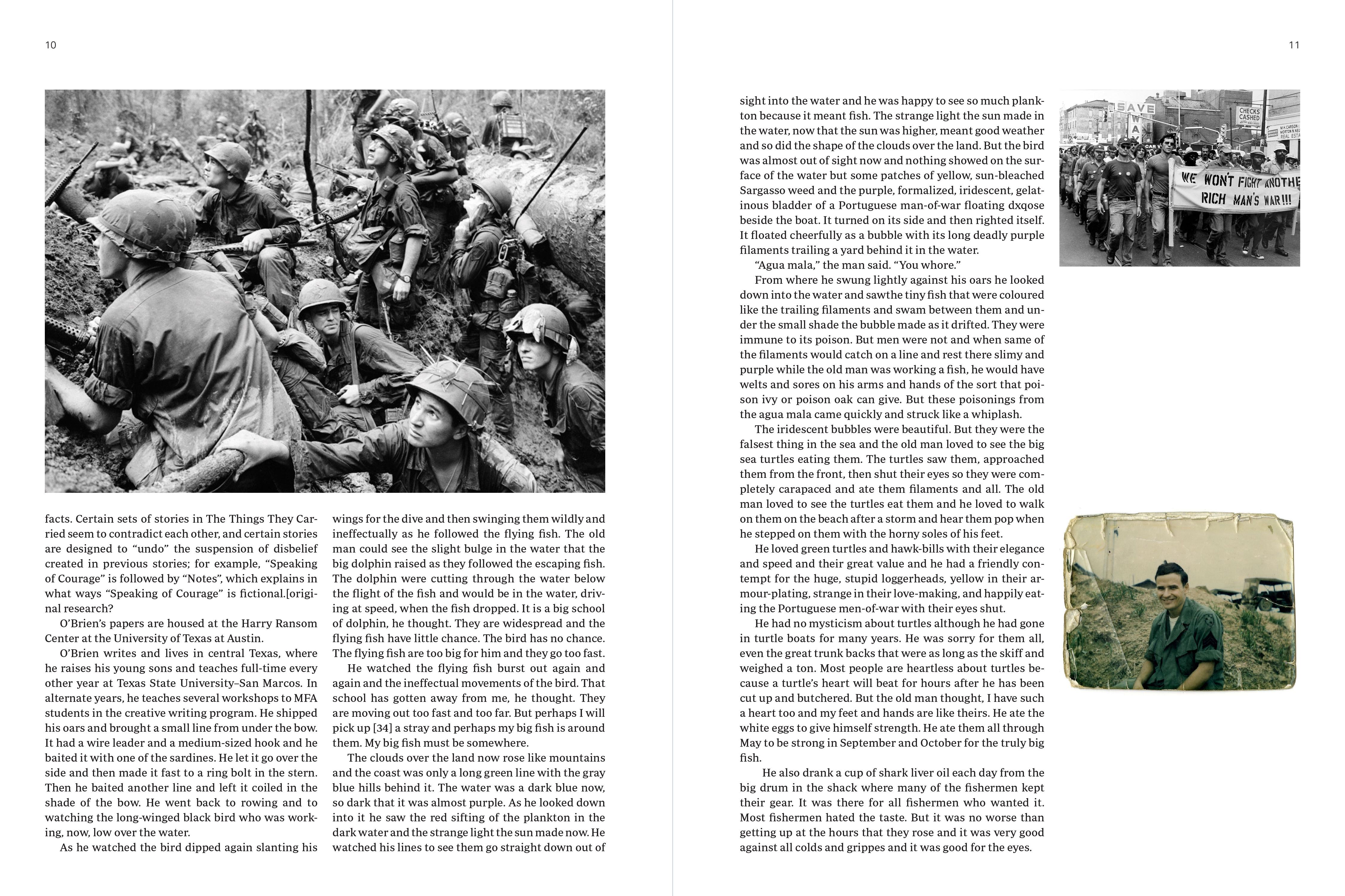
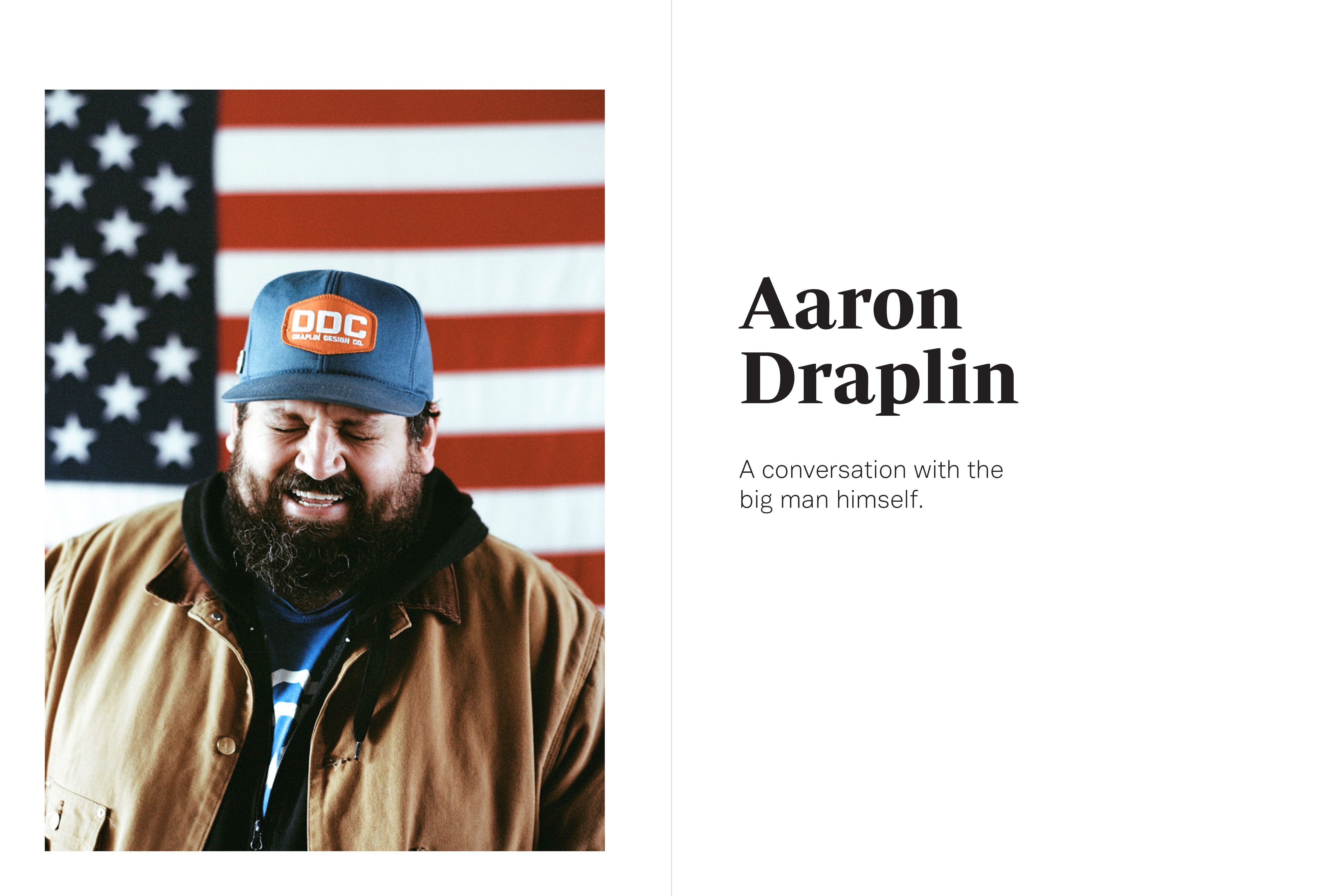
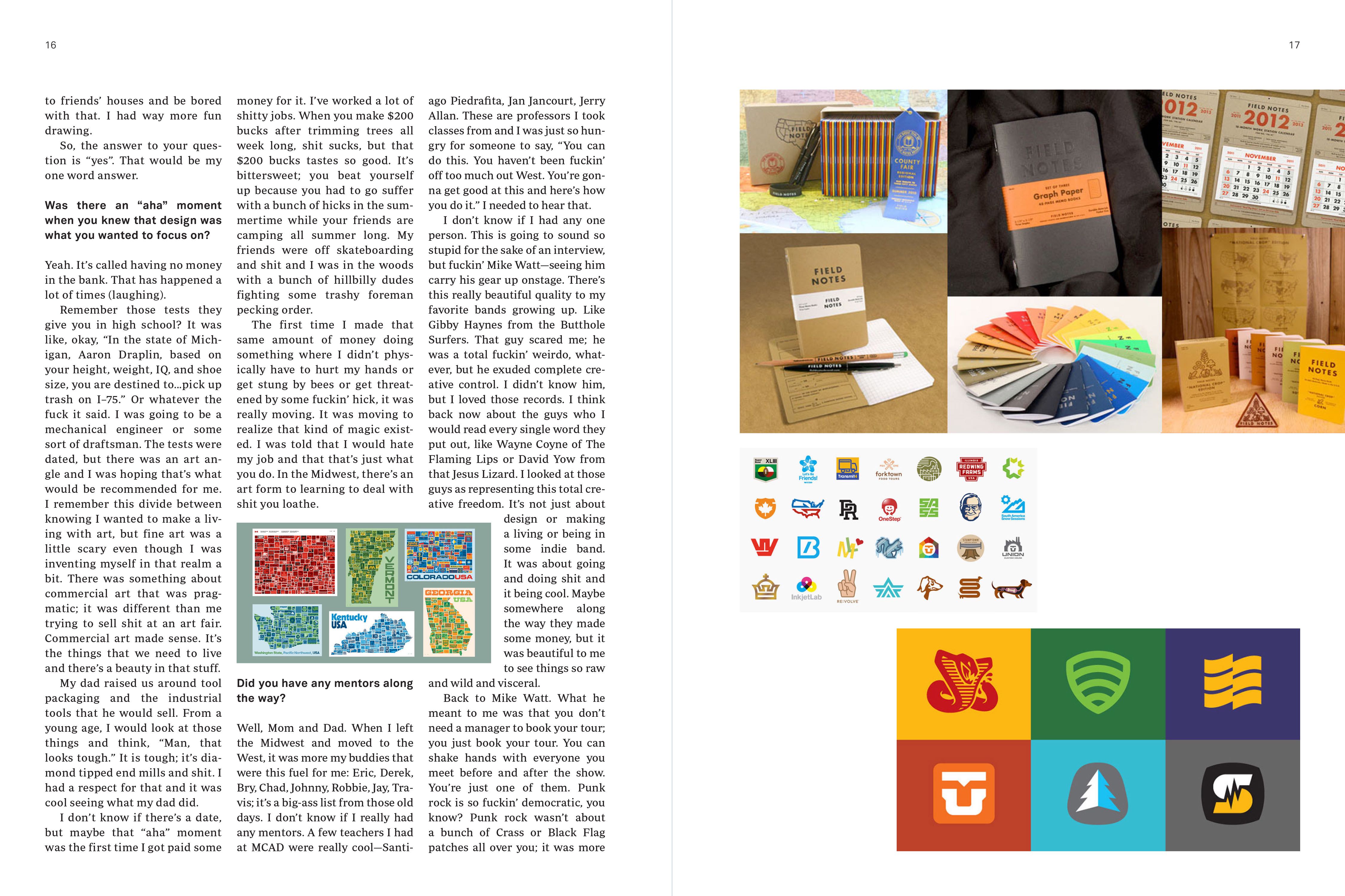
ALl of the content in the spreads below is filler content. I don't want to give anything away too early! However, Aaron Draplin and Tim O'Brien will be in the first issue.